Search
Search results
Red Otter (340 KP) rated Cthulhu Realms in Tabletop Games
May 29, 2019
Paul T (21 KP) rated Disney Villainous in Tabletop Games
Jun 22, 2019
Great theme and all of the characters fit well into the game! (1 more)
All characters have different win conditions but same general rule set for variety.
Some of the characters are much easier to win with while others have noticeably harder win conditions. (1 more)
Some rules and iconography can get confusing to new players
Jim LeBaron (69 KP) rated Gingerbread House in Tabletop Games
Mar 13, 2019
Clear Iconography (2 more)
Easy to Learn/ Easy Scoring
Beginner/Advanced Objectives
Bound to leave you cackling
Fun little game where you try to capture forest creatures/people by adding the right types of gingerbread to your house. Capture the highest point creatures and complete your objectives to be the player with the highest score! I liked that it has simple victory point objectives that work well for a first game or playing with younger children.
Red Otter (340 KP) rated Eminent Domain: Microcosm in Tabletop Games
May 29, 2019
Quick (2 more)
Portable
Surprisingly complex
A quick little game where you take a card from either the supply or the deck, then you either play a card or take your discard pile into your hand. Surprisingly complex with the scoring as each card has its own scoring conditions, so it pays to focus and understand what you need. Plays quick and tactics do matter. Hard for an overall strategy due to its speed and small package. Overall a good game for quick jaunts, but not one to play over and over again
The Marinated Meeple (1853 KP) rated Habitats in Tabletop Games
Mar 15, 2018
Tiles have good iconography (1 more)
Art is appropriate
Very interesting Tile Capture system, then you have to place them in your park and each tile is scored by what's around it.
what woulda crocodile need, lots of water and a rocky area to bask... therefore the croc tile needs 3 water tiles and a rocky tile near it. it makes sense an yet is hard to accomplish based on the market system which is challenging and interesting. I like this game, and really want to play it again.
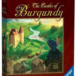
Samueljhague (1250 KP) rated The Castles of Burgundy in Tabletop Games
Mar 23, 2022
Building a better board game.
The Castles of Burgundy looks like a typical Euro- board game from the early 2000's it looks boring. It also looks more complicated than it ends up being. The amount of brain power use in this game has a good balance between cerebral and mindless. At the end of the game you have something in front of you that you have built and it feels good in that respect even if you haven't won the game. It can be played casually, and with your full attention. My wife and I enjoy playing this as two players. We have played this many times more as a two player game than any other game in our collection. This game gets top marks, and is as close to a perfect game as I have experienced.
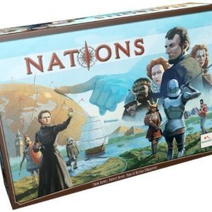
Entertainment Editor (1988 KP) rated Nations in Tabletop Games
Mar 8, 2018
As you can see from my reviews, the older I get, the more I appreciate quick, loud, light games. Nations isn’t any of those – this is a tried-and-true brain-burner on the longish side of things. I’ve tried many of those games and hated them (Agricola, Village, Trajan, ….) The difference here, as well as in hits like Eclipse and Castles of Burgundy, is that the rules are so simple and streamlined that you feel like you are not doing homework. In those other games, wrapping my head around playing the game was too much of a struggle to feel like it was enjoyable. Here, the game really just comes down to buying a bunch of cards from a row and then placing guys on them. The iconography and gameplay is so intuitive (and fitting with the theme) that I could easily begin to think about how to outmaneuver my opponents, even in the first game. Several days after my last play, I’m still eagerly thinking about the game, and that’s high praise.
Orignal Rating: 4/5
Reviewer: Derek Thompson
Read the Full review here: http://meepletown.com/2014/02/review-nations/
Orignal Rating: 4/5
Reviewer: Derek Thompson
Read the Full review here: http://meepletown.com/2014/02/review-nations/
Entertainment Editor (1988 KP) rated Yokohama in Tabletop Games
Mar 8, 2018
If you like worker placement games and the need to plan ahead then Yokohama is going to be right up your alley. There are so many paths and directions to take during the game that it can be overwhelming on your first play, but once you get a feel for how things shake out it can be very satisfying to plan out and execute a long term strategy. The board looks incredibly cluttered with iconography on first blush, but it is actually very easy to parse once you’ve got a feel for the layout of each Production board, and the random setup keeps things interesting game to game. Player interaction is indirect, although if you pay attention you can cause your opponents some headaches if you manage to beat them to places that they want to be. With that being said, you will want to leave yourself at least a few options each turn, because you can find yourself caught out if your opponents beat you to the punch, but if there’s one thing Yokohama has in spades it’s options.
Reviewer: Travis Williams
Read the full review here: https://techraptor.net/content/yokohama-review
Reviewer: Travis Williams
Read the full review here: https://techraptor.net/content/yokohama-review
Awix (3310 KP) rated The Invaders in TV
Mar 15, 2018 (Updated Mar 15, 2018)
One of the classic TV alien invasion shows; the theme tune and the various visual gimmicks (aliens with crooked little fingers who incinerate when killed) are quite well-remembered, along with (possibly) the fact that many of the episodes aren't actually any good.
Larry Cohen's original concept - a paranoid thriller with few overt SF elements - was rapidly abandoned, and Cohen himself had little involvement. The programme is really a victim of the time it was made: episodic storytelling means that the aliens come up with bizarrely different schemes on a weekly basis (weather control, infiltrating industry, man-eating butterflies), and there are nagging problems with the format - it is required that the aliens never just kill Vincent, and that he never manages to get evidence of their activity, either. Some would say that Roy Thinnes' intensely dour performance is not exactly what a show like this needs.
Still, there are some good individual episodes, and the iconography of the show does hang around in your head (it's clearly one of the shows that was a major influence on The X Files). It's a shame this kind of story has since been done to death as you could easily imagine a contemporary Invaders remake being really good (even though the 90s mini-series really wasn't).
Purple Phoenix Games (2266 KP) rated Tiny Epic Galaxies: BLAST OFF! in Tabletop Games
Mar 30, 2021
Yes, we have reviewed Tiny Epic Galaxies in the past. We loved it. It’s close to being a Golden Feather Award recipient. It has earned a spot on my Top 10 Games of All Time list. I cannot say enough great things about the game. But wait, a newer updated version has recently hit the scene. Is it just new art on the same game? Nope. Read on.
I will not be explaining the entire game in this review as indeed it is mostly the same game as before. However, I will be visiting some differences between this version and the original.
Firstly, the art is most certainly different. The card layouts are all different. The components are completely different. It is markedly improved for me, but I will save my gushings until the end.
Mechanics-wise, the differences are slight, but perfectly altered. For starters, many of the benefits of using planet powers have been streamlined, simplified, and make a lot of sense. Much of this has to do with iconography on the cards, but also the powers are mostly brand new. Additionally, this version rids players of the Secret Mission cards from the original. Now, I enjoyed that aspect of OG TEG, but I did not find myself pining for it whilst playing BLAST OFF! Also removed from this version is the seventh action die; BLAST OFF! comes complete with six dice total. Again, it reduces the number of actions that can be completed on a turn, but I haven’t missed that extra die. One of the greatest changes in this version is the Converter tweak. In the original game a player would need to sacrifice two inactive dice to convert a third die to whichever face was needed. In the new version, only one die is needed for sacrifice along with either one Energy or one Culture value. The Converter was always neglected in the older version, and now it’s a real option during play.
I do wish certain aspects of the older version were included, however. What has been eliminated in the streamlining process is the Solo mode and the fifth player. BLAST OFF! can accommodate two to four players now instead of one to five players, with the black components being axed from this version. I will miss the Solo mode mostly because I used to love breaking out the game later at night once the kids were asleep to try to conquer the Red rival (I almost never play Red). I do understand that a Solo mode may still be created in the future by Gamelyn directly or by another gamer.
All of these changes are minor, but equate to a much better gameplay overall. I do want to speak more on components, so let’s away with them.
Components. Okay, BLAST OFF! boasts improvements on the original game on every facet of components. Yes, the materials are similar quality, so it’s a wash there, but everything else is so much better. The dice are bigger, and ORANGE (great choice btw)! The iconography is much easier to understand and decipher throughout the game. The planets now have two new alignments: Life (plant icon) and Tech (gear icon). I feel the iconography and terminology in the first version could be confusing to new players, but plants vs gears is easy to distinguish. The ships are more stylized now, and the inclusion of this new Galaxy Slider to move up the Galaxy Track on the mats is most excellent. All of these improvements definitely cater to new Tiny Epic Galaxies players, and are most welcome as I try to convince my brother that this is one of the best games out there.
Obviously I am keeping this version and am seriously considering weeding out my original version of TEG with all expansions in favor for this. I just feel better playing it. It is more streamlined, easier to play and teach, and I love the way it looks on the table much more. One minor wish I have for the game is different player colors. This game could have been a triumph with just four different player colors from the original. Now, there’s nothing wrong with tried and true blue, yellow, green, and red, but I’m much more interested in playing a game with fuscia, purple, volt (like our green color we use throughout our branding), and aqua. Maybe it has to do with colorblindness, I don’t know, but take on the colors like are found in Seasons or something, and this game would blast off higher on my Top 10 Games of All Time list for sure.
That said, Purple Phoenix Games still gives this one a rocket of a GOLDEN FEATHER AWARD! If you are a fan of the original but wish new players to the game would enjoy it more, check out BLAST OFF! Nearly everything that has been changed caters to newer players and giving all players a more aesthetically-pleasing experience over the original. I will definitely be playing my copy a TON. Maybe if I ask nicely Gamelyn Games will make me some different player colors. Maybe.
